Maemo.org logo contest submissions
This page contains submissions for the maemo.org logo contest. The contest is now open! The closing date for entries is the 27th of July, 2008. For rules and submission guidelines, please see the contest page.
Entries for maemo.org logo contest
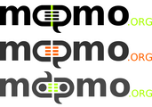
attila
-
 Maemo Butterfly (shadows)
 -
 Maemo Butterfly (no shadows)
 -
 Maemo Butterfly Inverse (shadows)
 -
 Maemo Butterfly Inverse (no shadows)
deadknight88
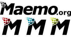
crawfordm
-
 Signifying community and wireless technology.
thiercito
jobelium
I did that with free font and a lot of fun ! :p edit: I have dumped a lot of ugly or non-original logo, to make place of a more conceptual logo and i regroupe then by theme.
ps: im a frenchspeaker sory for the inconveniant!
J'ai fait cela avec des fonts gratuits et beaucoup de plaisir ! ;) edit: jai jeter beacoup de logos laids et pas tres originals, pour faire place a des logo plus conceptuel et je l'ai est regroupés par theme.
-
 the bleu logo wtih nerds glass
 -
 alternate color with frame
 -
a metalic logo version 1
-
a metalic logo version 2
-
 a metalic logo version 3
 -
a metalic logo version 4
-
 a metalic logo version 5
 -
 college style with Tux !
 -
 Tux with alternate font (i like the .org)
 -
 the same with alternate color
 -
 the big colorfull Tux logo
 -
 the small Tux logo
 -
 an alternate version of the small logo
 -

-
-
-
-
-
 this is a concept of the fusion of the letter E A O
 -
 an alternate version of "the fusion of the letter E A O" logo's
 -

-
rsperberg
-
 Re-using Karoliina's original color scheme
 -
 More logo-like
 -
 Maemo.org isn't a company but a group of people who all contribute toward the same goal. So you don't get "machined" results. But a lot of the vibrancy comes from the non-automaton approach that is the essence of Linux and the FOSS movement.
 -
 Version with splashier colors (but any could be used). The handlettering is available as a font so that it can be used for tabs, titles and such in the wiki redesign.
 -
 When a horizontal layout is inappropriate, a square form can be used instead.
 -
 The square form with splashier colors. Favicon could use "m.o" or just "m" to remain readable, in the color scheme chosen, of course.
GarethLWalt
-
 Custom typography. The lettering on this logo was created carefully on a grid. The color and outline are examples.
 -
 Focus on wireless.
 -
 Alternative typography.
 -
 Plain, simple, limitless.
 -
 Boxed with phrase.
baksiidaa
-
 I like having the ".org" as a superscript—that way it's a non-integral part of the logo that could be replaced to create a logo for something besides the website.
 -

-

joeaguy
-
 Bitmap with negative space, wide. Big, bold, technical, with a soft edge.
 -
 Bitmap with negative space, narrow. Minimalist pixel theater.
 -
 Bitmap with negative space, narrow and inverse. Now is the time on Sprockets when we dance.
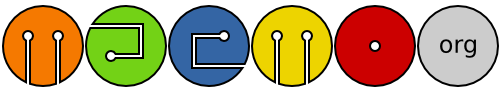
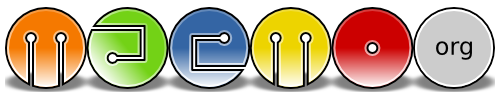
Narbat
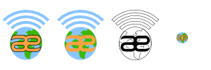
Variations on a theme, using different fonts. The "ae" in "maemo" seems to stand out, so I wanted to incorporate that into the design. I also wanted to incorporate something about what the platform is, hence the globe and wifi signal bars. These logos can be used with the full "maemo.org" spelled out, or just the globe and "ae" portion for when something narrower is needed. In the variations you can see what the logo looks like in monochrome, and how it looks as a 16x16 favicon. This logo uses only four colors (blue, green, orange, and black) with no gradients or dithering, which makes it easy to silk-screen onto a t-shirt.
-
 Font A
 -
 Font A Variations
 -
 Font B
 -
 Font B Variations
 -
 Font C
 -
 Font C Variations
 -
 Font D
 -
 Font D Variations
 -
 Font E
 -
 Font E Variations
jussi
-
 The idea: The a and e ligature formed of dots signifies that the maemo is built on the collaborate effort of the community, and the mœbius loop / strip embedded in the ligature shows that there are infinite possibilities when you work together. Update: Changed the m-s and the thickness of the dots.
 -
 Alternative version, dynamic width on the dots to give more 3d-feel.
 -
 Alternative version, solid moebius strip. Updated with some feedback from User:thiercito.
 -
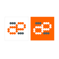 Symbol only, to use for instance as favicon or on t-shirt print.
 -
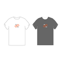 T-shirt examples
calderov
-
 I hope you like this ^^.
chrismtn
-
 Have fun!.
convulted
-
 Maemo.org
rsuplido
Helvetica is used on all logos, my favorite font. All logos use orange-red as the background but can be anything. I hope you enjoy them. --Reggie 13:45, 21 June 2008 (UTC)
-
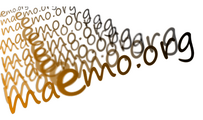
 Morse Code: Simple and sharp. I added the morse code version of 'maemo' at the bottom to signify a classic sense of 'communication.' Click image for a sharper version of the logo.
 -
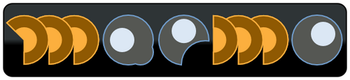
 Zen: maemo is syllabicated and placed inside a Zen Enso symbol. Parts of 'maemo' and '.org' touch the circle. Circle is intentionally broken since "imperfection is an essential and inherent aspect of existence." Click image for a sharper version of the logo.
 -
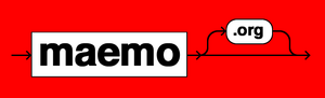 Syntax 1: maemo.org is represented in a Syntax diagram. It somehow shows that maemo can be open source via the '.org' or can be bypassed, maybe to signify commercial apps. Click image for a sharper version of the logo.
 -
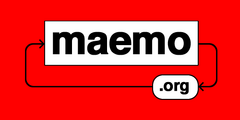 Syntax 2: maemo.org is represented in a Syntax diagram. A playful version to represent an infinite loop -- a never-ending maemo community discussion. Click image for a sharper version of the logo.
Cas
-
 Sorry about the amount of gradients also using the old Color scheme
furrball
-
 I didn't actually set off to create something that looks so much like the contacts icon. This is just what came to mind when I thought of a collaborative process and these colors are what looked best after trying many combinations.
 -
 The blue and orange were my second choice so I included them. I felt the styled "e" should stay as a nod to the past, contrasted by the sharp angled font on the word "maemo" and coming together for something similar but unlike either in the "RG" of org. Perhaps I thought about it a bit too much :)
michael
-
 Maemo.org logo (white)
 -
 Maemo.org logo (black)
 -
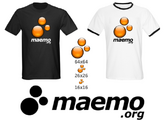 Logo 04 for favicons and t-shirts (white)
 -
 Logo 04 for favicons and t-shirts (black)
 -
 Alternative experiment on green.
 -
 Alternative on green + favicon
femorandeira
-
 Geometric shapes that scale well and Tango colors for a robotic look.
 -
 Similar to the previous one, but with fancy gradients.
 -
 Round shapes, dark background, contrast and an old school inspiration.
angun33
-
 Community connected
 -
 Using different icons for representation of the people (community)
 -
 3D look version
 -
 Just for fun the logo on the t-shirt. Showing different people come together for maemo :)
wazd
![]()
Hello. I had some troubles with "Maemo.org" name so I used "Maemo-org" instead. Sorry for that.
Logo symbolizes I think all of the community aspects. A not childish but not too old (as our community is) human (as a main part of the community) spread his hands to all the people (we are welcome to everyone) and same time he breaks the borders and reaches the outer perspectives (same thing that we do in our open source world without any limitations) By the way "open source" is nicely integrated here too. His head shines bright with ideas in all ways like the sun. And if you'll place two logos near, people will look like they shaking hands. Logo can be anycoloured, but I prefer blue cause it's very calm for website design :) Whew, I'm done :)
rrainist
-
 In the first version, the open community acts like a forum/shelter, lifting the maemo up.
 -
 In the second version, the open community acts like a foundation, pushing the maemo upwards. :)