Maemo.org logo contest submissions: Difference between revisions
imported_>deadknight88 |
imported_>jensen |
||
| Line 666: | Line 666: | ||
=== jensen === | === jensen === | ||
<gallery widths=" | <gallery widths="400px" perrow="3"> | ||
Image:Maemo.org_logo_contest_jensen_11.png| | Image:Maemo.org_logo_contest_jensen_11.png|Networked tablet platform supported by a community | ||
Image:Maemo.org_logo_contest_jensen_12.png| | Image:Maemo.org_logo_contest_jensen_13.png|more people providing support | ||
Image:Maemo. | Image:Maemo.org_logo_contest_jensen_14.png|Favicon (suggests community support) | ||
Image:Maemo.org_logo_contest_jensen_12.png|reliable open support | |||
Image:Maemo.org_logo_contest_jensen_15.png|Favicon (suggests support and wireless capability ) | |||
</gallery> | </gallery> | ||
Revision as of 22:32, 26 July 2008
This page contains submissions for the maemo.org logo contest. The contest is now open! The closing date for entries is the 27th of July, 2008. For rules and submission guidelines, please see the contest page.
Entries for maemo.org logo contest
attila
-
 Maemo Butterfly (shadows)
 -
 Maemo Butterfly (no shadows)
 -
 Maemo Butterfly Inverse (shadows)
 -
 Maemo Butterfly Inverse (no shadows)
deadknight88
-
 wifi-transmission
 -
 key to future!!
 -
 key2
key2 -
 dashed
 -
 dashed2
 -
 digital
 -
 darkblue&lime
 -

-

-

-
-
-
 Community presentation
 -

crawfordm
-
 Signifying community and wireless technology.
thiercito
Less is More concept of the maemo.org logo. By adapting the letter "a" into the "e" we are suggesting the versatility and adaptiveness of the maemo platform
jobelium
I did that with free font and a lot of fun ! :p
NB: Most of then can be colored differently.
J'ai fait cela avec des fonts gratuits et beaucoup de plaisir ! ;)
NB:la couleur de la majorité de mes logos peut être modifié.
PS: im a frenchspeaker, sory for the inconveniant!
-
 the nerds glass logo's
 -
 t-shirt version
 -
 the icon version
 -
 red version of the nerds glass logo's
 -
 t-shirt version
 -
 the icon version
 -
 this his the modified version "integrate .org"
 -
 t-shirt version
 -
 the icon version
 -
 the big AE square style in blue color with the "org" under de "maemo" on yellow background
 -
 tshirt version
 -
 the icon version
 -
 "big AE square style" straighted.
 -
 t-shirt version
 -
 the icon version
 -
 red version with
 -
 t-shirt version
 -
 the icon version
 -
 the O upper the M represente a buddy with wireless communication (telepathy?)
 -
 t-shirt version (both logo can be in front)
 -
 the icon version
 -
 a variant with only the head of the buddy,and also look like a tablet with wireless!
 -
 t-shirt version (both logo can be in front)
 -
 the icon version
 -
 this is a concept of the fusion of the letter A E O.
 -
 t-shirt version
 -
 the icon version
 -
 an alternate version of "the fusion of the letter A E O" logo.
 -
 t-shirt version (both logo can be in front)
 -
 the icon version
 -
 this is the "o under the word maem(o)" with the .org into the O.
 -
 t-shirt version (both logo can be in front)
 -
 the icon version
 -
 this is the "o under the word maem(o)" with green on black.
 -
 t-shirt version (both logo can be in front)
 -
 the icon version
 -
 this is a variant of "the O under the word maem(o)" logo.
 -
 the t-shirt version (both logo can be in front)
 -
 the icon version
rsperberg
Some thoughts behind the design posted at Internet Tablet Talk. The "M" in the first logo, the "g" in the latter can be tweaked to satisfy everyone. Enjoy! Roger
-
 Re-using Karoliina's original color scheme
 -
 More logo-like
 -
 Maemo.org isn't a company but a group of people who all contribute toward the same goal. So you don't get "machined" results. But a lot of the vibrancy comes from the non-automaton approach that is the essence of Linux and the FOSS movement.
 -
 Version with splashier colors (but any could be used). The handlettering is available as a font so that it can be used for tabs, titles and such in the wiki redesign.
 -
 When a horizontal layout is inappropriate, a square form can be used instead.
 -
 The square form with splashier colors. Favicon could use "m.o" or just "m" to remain readable, in the color scheme chosen, of course.
GarethLWalt
-
 Custom typography. The lettering on this logo was created carefully on a grid. The color and outline are examples.
 -
 White background alternative.
 -
 Focus on wireless.
 -
 Alternative typography.
 -
 Plain, simple, limitless.
 -
 Boxed.
 -
 Boxed alternative.
 -
 Alternative to a previously removed image (due to a resemblance to another company's logo. More info in the Discussion.)
 -
 Modern typeface with alternate underlines.
baksiidaa
joeaguy
-
 Bitmap with negative space, wide. Big, bold, technical, with a soft edge.
 -
 Bitmap with negative space, narrow. Minimalist pixel theater.
 -
 Bitmap with negative space, narrow and inverse. Now is the time on Sprockets when we dance.
Narbat
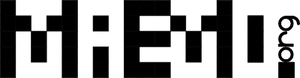
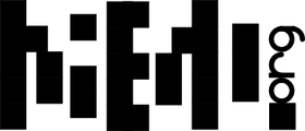
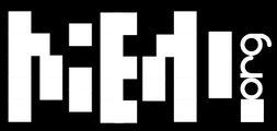
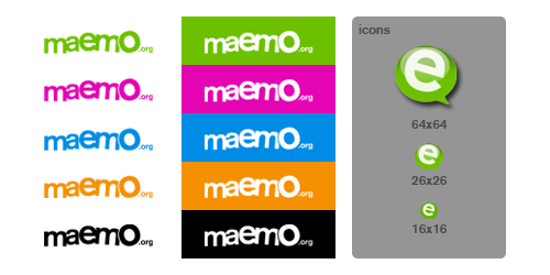
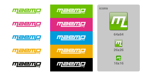
Variations on a theme, using different fonts. The "ae" in "maemo" seems to stand out, so I wanted to incorporate that into the design. I also wanted to incorporate something about what the platform is, hence the globe and wifi signal bars. These logos can be used with the full "maemo.org" spelled out, or just the globe and "ae" portion for when something narrower is needed. In the variations you can see what the logo looks like in monochrome, and how it looks as a 16x16 favicon. This logo uses only four colors (blue, green, orange, and black) with no gradients or dithering, which makes it easy to silk-screen onto a t-shirt.
-
 Font A
 -
 Font A Variations
 -
 Font B
 -
 Font B Variations
 -
 Font C
 -
 Font C Variations
 -
 Font D
 -
 Font D Variations
 -
 Font E
 -
 Font E Variations
jussi
The basic idea: The dots represent the many parts which make up the community, and together they form the ae-ligature and a moebius strip, to signify the infinite possibilities of collaboration.
I started over a little. After coming back a while later and looking at my submissions, this is what I thought.
- After looking at it again; I felt like the ae-ligature didn't really work as it was. It is not 100% clear, and it doesn't work nicely with the typography; and I don't think it will in the current dot format.
- I still liked the moebius strip formed of dots, though, which I think is a strong idea which works really well in this context, so I decided to keep it.
- I wanted the logo to be "nicer", friendlier, more organic. That is more what a community is like, not something digital, gridded and rough.
- This also applied to the colours. A cooler, smoother colour would be better than an agressive orange.
- The typography was changed to one that has a little more character.
Updated as of july 26.
-
 Main logo
 -
 Negative
 -
 Alternative version (for vertically challenged placing), and black and white.
 -
 Just the icon! (with a touch of gradient)
 -
 Alternative colours.
 -
 By popular(?) demand. I kinda like it, but it's not as clear as the other ones.
(the old ones are on the talk page)
calderov
-
 I hope you like this ^^.
chrismtn
-
 Have fun!.
convulted
-
 Maemo.org
rsuplido
Helvetica is used on all logos, my favorite font. All logos use orange-red as the background but can be anything. I hope you enjoy them. --Reggie 13:45, 21 June 2008 (UTC)
-
 Morse Code: Simple and sharp. I added the morse code version of 'maemo' at the bottom to signify a classic sense of 'communication.' Click image for a sharper version of the logo.
 -
 Zen: maemo is syllabicated and placed inside a Zen Enso symbol. Parts of 'maemo' and '.org' touch the circle. Circle is intentionally broken since "imperfection is an essential and inherent aspect of existence." Click image for a sharper version of the logo.
 -
 Syntax 1: maemo.org is represented in a Syntax diagram. It somehow shows that maemo can be open source via the '.org' or can be bypassed, maybe to signify commercial apps. Click image for a sharper version of the logo.
 -
 Syntax 2: maemo.org is represented in a Syntax diagram. A playful version to represent an infinite loop -- a never-ending maemo community discussion. Click image for a sharper version of the logo.
Cas
-
 Sorry about the amount of gradients also using the old Color scheme
furrball
-
 I didn't actually set off to create something that looks so much like the contacts icon. This is just what came to mind when I thought of a collaborative process and these colors are what looked best after trying many combinations.
 -
 The blue and orange were my second choice so I included them. I felt the styled "e" should stay as a nod to the past, contrasted by the sharp angled font on the word "maemo" and coming together for something similar but unlike either in the "RG" of org. Perhaps I thought about it a bit too much :)
michael
-
-
-

-
-
-
-
-
-
-
-
 Variation on n.06
 -
 Variation on n.11
 -
femorandeira
-
 Geometric shapes that scale well and Tango colors for a robotic look.
 -
 Similar to the previous one, but with fancy gradients.
 -
 A geometric and old school look.
 -
 Some gradients and reflections for the web.
angun33
-
 Community connected
 -
 Using different icons for representation of the people (community)
 -
 3D look version
 -
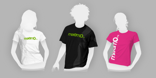
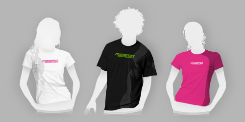
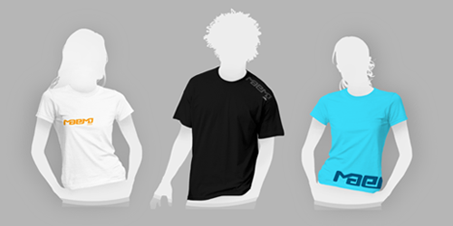
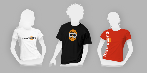
 Just for fun the logo on the t-shirt. Showing different people come together for maemo :)
 -
 OK another version with the icon as a person figure now
 -
 3D look version
wazd
Hello. I had some troubles with "Maemo.org" name so I used "Maemo-org" instead. Sorry for that.
Logo symbolizes I think all of the community aspects. A not childish but not too old (as our community is) human (as a main part of the community) spread his hands to all the people (we are welcome to everyone) and same time he breaks the borders and reaches the outer perspectives (same thing that we do in our open source world without any limitations) By the way "open source" is nicely integrated here too. His head shines bright with ideas in all ways like the sun. And if you'll place two logos near, people will look like they shaking hands. Logo can be anycoloured, but I prefer blue cause it's very calm for website design :) Whew, I'm done :)
-
 Full logo
 -
 Slightly simplified (maybe better)
 -
 Usage example :)
 -
 Slightly improved logo, now Maemo Guy is looking forward into the future. I've removed visual division between maemo and org because community is in close touch with platform. Some fancy senseless gradient also added :)
 -
 Minimalistic style. This looks like mathematic function that represents unity of Maemo platform and Maemo Community. Some "wireless smell" also added :)
rrainist
-
 In the first version, the open community acts like a forum/shelter, lifting the maemo up.
 -
 In the second version, the open community acts like a foundation, pushing the maemo upwards. :)
timsamoff
Note: I've honed my submissions down to my favorite ideas. For the rest, please view the Discussion page. --timsamoff 14:38, 26 June 2008 (UTC)
- Really appreciated. Pruning is a well known method to get better flowers and fruits.--qgil 15:41, 26 June 2008 (UTC)
-
 Submission #1g - The word intertwines to form a symbol of the path (and process) that our community travels.
 -
 Submission #9b - Think of it this way: "Maemo Period."
polyxena
-
 keyboard letters! (the .org part could be in alternate colors - I orginally used orange to mimic the WiMax version I am so eagerly awaiting but then decided not to tie it so explicitly to that)
 -
 vresion 1 of maemo and org co-joined through the linked Os
 -
 version 2 - with wireless added and showing an alternate color
 -
 version 3 - with .org in casual writing to reflect the community
blaxnux
-
 An OK Sign. The code is on your hands anyway... :P The OK sign is the faveicon.
 -
 Brick that glow without grads or blurs. Mind-tricky aura. :P The blue AE is the faveicon.
mrunx
Variations on a Maemo "good vibes" theme...
- Typography used: "Domestic Manners", a Public Domain/GPL font by Dustismo
firebird8
-
 "Openess, Creativity, and Direction"
 -
 "Simple"
aakash121
-
 Dispersal
shivankan
-
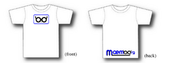
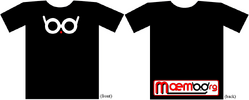
 Characterization - bringing in a life element
 -
 O.O
O.O -
 maemo dot org
 -
 maemo as an org
 -
 can see a version of TUX / individual's (live orange) contribution to the maemO.Org (the big circle with a concentrating dot at center - focus)
sohle
-
 1: Easy to read font, only two different colors, abstract people building the logo from the left and right side (symbolizes the community)
 -
 2: Same theme, different font
 -
 3: Same theme as submission 2 but with bold "ae"
 -
 4: Same theme as 1 but green
 -
 5: Same theme as 2 but green
 -
 6: Same theme as 5 but with bold "ae"
 -
 7: Small versions of 1, 2, 3 (for stickers, pins, etc.)
 -
 8: Small versions of 4, 5, 6
 -
 9: Alternative small versions
underscore
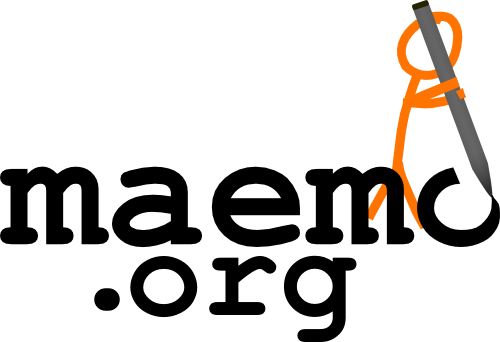
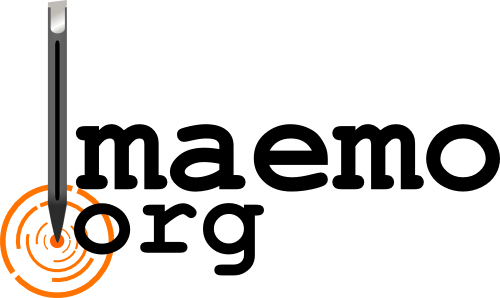
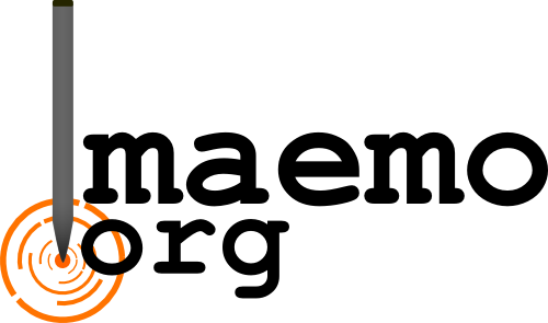
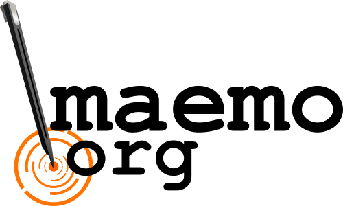
Two versions of each image were submitted in case there was an issue using the Nokia stylus in the logo. I substituted a generic stylus into the second image. Hopefully this wont cause any complications. :) *I have the images available without gradients as well, if that becomes an issue.
- The ideas is cool and personaly I like the little man drawing. However, an issue to consider here is that Maemo-the-software is moving towards thumb/finger use as default, being a stylus a secondary case. In my opinion this concept wouldn't survive the next Maemo releases...--qgil 06:45, 27 June 2008 (UTC)
-
 The person drawing the Maemo.org logo shows that members of the community can make contributions to Maemo. M can be used as a favicon.
 -
 With generic stylus.
 -
 Emphasizes the use of a stylus in Maemo linux. The touchscreen feature is the most important feature to me.
 -
 With generic stylus.
 -
 This is a variation of entries 3 and 4. It's a bit more complex, but I think it looks nicer. If the judges are leaning towards a simpler look to the logo, then 3 or 4 would be better.
 -
 With generic stylus.
![]() This is a possible favicon for entries 3, 4, 5, and 6.
This is a possible favicon for entries 3, 4, 5, and 6.
eemaju
The purpose was to emphasize strong and happy colors and humane factors. Bright color was selected to gain more visibility, and orange contains legacy from maemo perspective. Fingerprint is driven by the presence of touch, as well as the font face which looks like that it is hand drawn. Tried to remove everything that can be considered "technical".
-
 Maemo fingerprint
 -
 Maemo fingerprint inverted
 -
 T-shirt example 1
 -
 T-shirt example 2
 -
 Icon
Icon
lav4you
Maemo.org This name and logo is created keeping in the mind that now maemo can handles more and more complex apllication and processes, e of maemo articulates that complexity of it and the integrity among the community and developer with fresh illusive look. I hope you will like it.
-
 Name1
Name1 -
 Icon1
Icon1 -
 Name2
Name2 -
 Icon2
Icon2 -
 Name3
Name3 -
 Icon3
Icon3 -
 Name4
Name4 -
 Name5
Name5
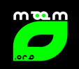
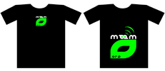
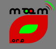
Here joint m indicates the integrity between man (Developer Community & users), maemo and mobile.
-
 Name6
Name6 -
 Icon4
Icon4
Below design reflect the horizon at which Maemo stands. Its simplicity and usability is indicated in the form of illusive teddy bear look, M with the butterfly effect indicates the open source community philosophy. Its rareness is indicated by illusive panda effect,integrity and sharing between community members is indicated through joint OO effect and popularity of Maemo is reflected in these catchy icon.
-
 Name7
Name7 -
 Icon5
Icon5 -
 Name8
Name8 -
 Icon6
Icon6 -
 Name9
Name9 -
 Icon7
Icon7 -
 Name10
 -
 Icon8
Icon8 -
 Name11
 -
 Icon9
Icon9
In these design the butterfly effect reflects the open source community philosophy. Different colors in butterfly wings or M articulates the wide application of Maemo software, its mobility aspects and different culture of developers and users.
-
 Name12
 -
 Icon10
 -
 Name13
 -
 Icon11
 -
 Name14
 -
 Icon12
 -
 Name15
 -
 Icon13
pixel6784
-
 Large size Logo email me at pixel_6784@yahoo.com
 -
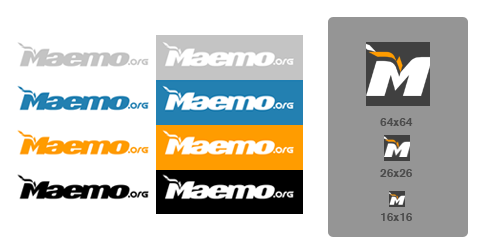
 Large size Logo with Silhouette and 16x16 favicon
gavren
affonso
This logo focus on transmitting two of the key concepts of maemo.org: team work and freedom. To illustrate these ideas the typography was drawn with characters that varies on rotation and size but at the same time supersedes it other and sharing the same place. --Abraão Affonso @ OpenBossa Design Team (http://www.openbossa.org)
-
 Fluffy render
 -
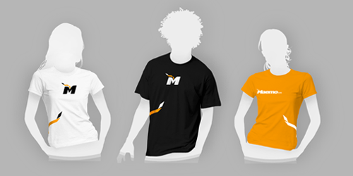
 t-shirts
 -
 Flat render with color variations and icons.
 -
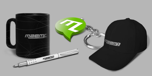
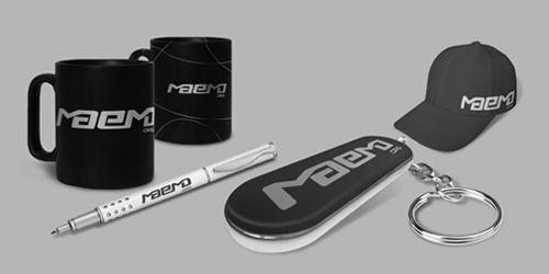
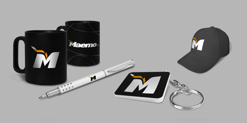
 Gift suggestions
This logo aims to highlight though simple forms the most important characteristics of Maemo.org like the sense of community and spirit of innovation. It also transmits the feeling of continuity, one of the keys to open source success, by using a custom font that mimics the word "maemo" as it would like if written with a single stroke. --Abraão Affonso @ OpenBossa Design Team (http://www.openbossa.org)
-
 Flat render
 -
 t-shirts
 -
 Flat render with color variations and icons.
 -
 Gift suggestions
glaoliver
Simplicity and connectivity were the main concepts used to design this logo. Though its elegant forms and precise use of color represents some of the basic valors of maemo.org: like creativity. stability and cleverness, something that can be trust. --Glaubert Oliveira @ OpenBossa Design Team (http://www.openbossa.org)
-
 Fluffy render
 -
 t-shirts
 -
 Flat render with color variations and icons.
 -
 Gift suggestions
The idea behind this logo is about continuity and improvement of a process, it reflects how maemo.org acts as a bridge uniting people who share the same objectives and goals. --Glaubert Oliveira @ OpenBossa Design Team (http://www.openbossa.org)
-
 Flat render
 -
 t-shirts
 -
 Flat render with color variations and icons.
 -
 Gift suggestions
This logo is based on the relationship, evolution and continuous effort of the maemo community to attain better solutions and products in less time. It also transmits trough it typography and discreet use of color the idea of technology, movement and boldness. --Glaubert Oliveira @ OpenBossa Design Team (http://www.openbossa.org)
-
 Flat render
 -
 t-shirts
 -
 Flat render with color variations and icons.
 -
 Gift suggestions
peres
This logo focus on the technological and sharing aspects of maemo.org, It represents the bound and the energy that constantly flows from the point where the platform meets the community. --Miguel Peres @ OpenBossa Design Team (http://www.openbossa.org)
-
 Fluffy render
 -
 t-shirts
 -
 Flat render with color variations and icons.
 -
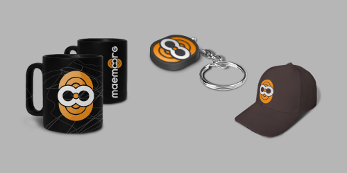 Gift suggestions
This logo emphasizes some of the principals aspects and objectives of the maemo community like sharing/reuse, technology and improvement. It transmits a solid aspect and at the same time illustrates something flexible with parts that can be easily rearranged. Its unique and simple typography aims to look clear in different sizes and resolutions and has also a hidden catch to make "maemo.org" easy to remember, representing some of the fun and joy of being part of this community. --Miguel Peres @ OpenBossa Design Team (http://www.openbossa.org)
-
 Flat render
 -
 t-shirts
 -
 Flat render with color variations and icons.
 -
 Gift suggestions
nazo
This logo is simple and clean. It's easy and economic for producing promotional gifts and brochures as it contains two colours.
-
 Logo and icon
 -
 Tshirt
-
 Logo and icon
setan_666
-
 Simple blue butterfly logo. Beautiful and free.
jrouyer
-
 Dialogue Motif
karnhack
-
 code in your hands
 -
 code in your hands
 -
 code in your hands
 -
 code in your hands
wavek9
-
 Emphasizing Open Source
 -
 Simplified version
amirullah
-
flexybility
-
across the world
brnk
-
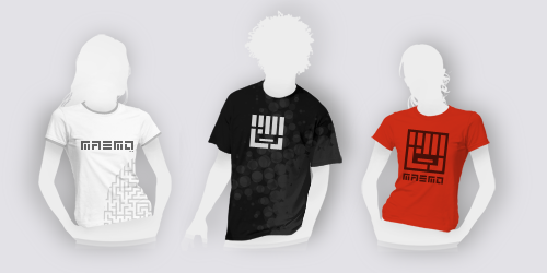
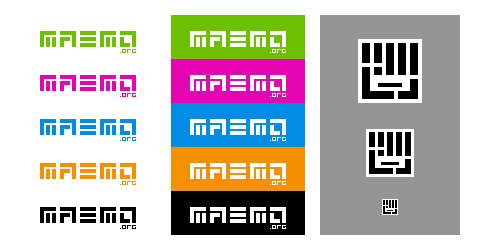
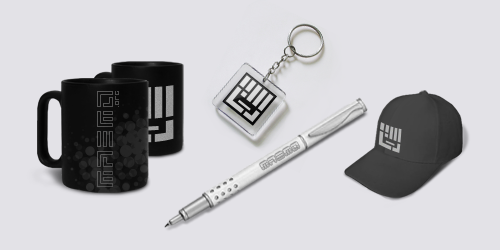
 The ae feature symbolizes the interaction of people within the community. The hand has many meanings in this context, the most important being that Maemo is used in hand-held devices, the 'hand-work' of the community and the outreach to future contributors (its a high-five, isn't it... or some sort of greating).
 -
 The main features joined makes the icon.
 -
 Main logo with black background. Makes for a nice t-shirt.
 -
 The icon on a black background.
unique311
-
 give me an n810
 -
 please give me an n810
 -
 my n800 is kinda getting old
 -
 perty please, give me an n810
srosa
-
 Pure typographic submission — avoiding trendy style —; the middle 'm' stem as stylus; strong visual impact; good readability at small sizes. Just one color/ink. Original color and variation.
 -
 Update: 'maemo' logos without the '.org', and the t-shirt and screen applications deleted. Just symbol, logo and favicon
samlowry
-
 Simple, clean, happy.
shockgen
-
 The origami, trys to transmits the idea of open source free software.
 -
 White background. The big maemo community and the big box of software and possibilites that an Internet Tablet offers you.
 -
 With darker background, that highlights the box. The big maemo community and the big box of software and possibilites that an Internet Tablet offers you.
 -
 Simply, maemo around the world.
 -
 All type of exchange software and source code.
cjb
-
 open source. I know this is debatable and probably will not be used. But hope to spark interest of what maemo is.
samantha
-
 Ispired to the fact that Maemo is based on an active community of people.
 -
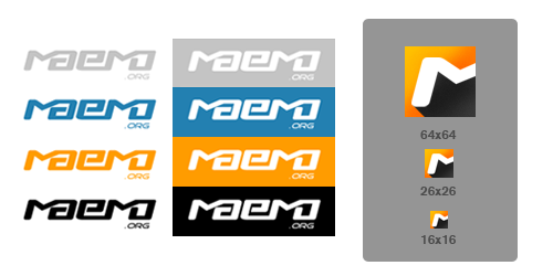
 Color variations and favicons of the logo (click to enlarge).
-
 The dots represent the community.
 -
 Again, community is the idea around which I've designed this logo.
vdepizzol
-
 Simple and smooth logo created with custom typography. Less is mo :).
Munk
-
 Maemo is progressing towards a finger only based input + notice the flat, no edges, paper like hardware which again we are progressing towards.
 -
 Orange background
 -
 Red background
 -
 Blue background
 -
 Touch as the center of the interface
 -
 Without the hand
rambutan
amir
-
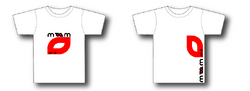
red arrow at 'M', likely accuracy
-
red arrow at smooth 'M', likely accuracy
-
the sign, simplicity but validity -- applicable in many background colours.
mexicopepito
-
 Universal logo
ubikdosmil
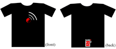
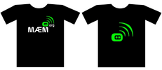
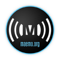
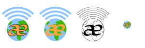
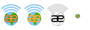
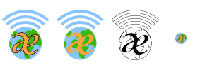
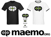
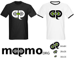
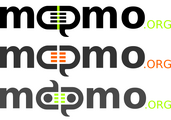
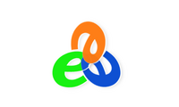
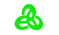
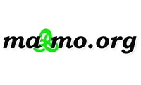
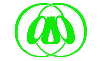
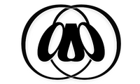
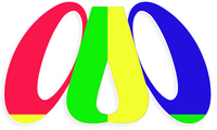
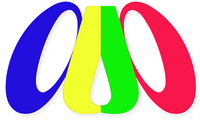
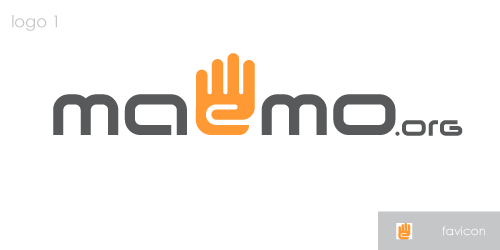
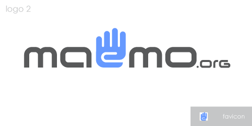
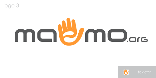
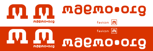
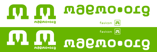
jensen
-
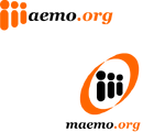
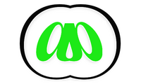
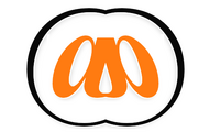
 Networked tablet platform supported by a community
 -
 more people providing support
 -
 Favicon (suggests community support)
 -
 reliable open support
 -
 Favicon (suggests support and wireless capability )